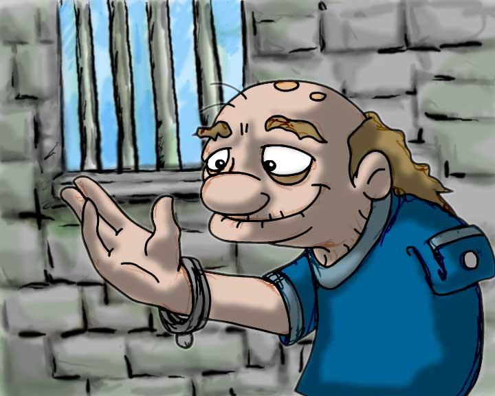
I think it looks really nice with colour, i like your tone mattes (shadows, and that you haven't cleaned up the drawing to within an inch of its life. I think if you keep enough of that rough line quality in the ink, then your colours will look great!
My thoughts on colour are that maybe his skin should be a little paler, or greyer, and that the blue of his shirt should also be less saturated. I'd recommend maybe making a lineup of five or six of him, and colour each one slightly different, and see which one works best...
Lookin' good!!! Hopefully by the end of today I'll be able to post some of my work in progress on my blog!! Better get to work...
You're right about the clean-up....the problem is I'll have to do the rough animation for all of the frames.......but i suppose that's a good thing, cause it'll make better movement.
It's good but I think you need to emphasize the place he's in using stronger colour tones. Probably less "colour" or less of different colours... just my two cents
now that I think about it, I reckon making the wall behind him get darker further down - like a gradient or fade from top to bottom - would make him stand out more - obviously this is just a test frame, but in your final film something like that might look cool on your bg's!
I think it looks really nice with colour, i like your tone mattes (shadows, and that you haven't cleaned up the drawing to within an inch of its life. I think if you keep enough of that rough line quality in the ink, then your colours will look great!
ReplyDeleteMy thoughts on colour are that maybe his skin should be a little paler, or greyer, and that the blue of his shirt should also be less saturated. I'd recommend maybe making a lineup of five or six of him, and colour each one slightly different, and see which one works best...
Lookin' good!!! Hopefully by the end of today I'll be able to post some of my work in progress on my blog!! Better get to work...
You're right about the clean-up....the problem is I'll have to do the rough animation for all of the frames.......but i suppose that's a good thing, cause it'll make better movement.
ReplyDeleteI shall experiment with the colours.
I shall await your progress post!
YOu are meant to be in class!! right now!!!
ReplyDeletehe he the BOTH of you....
It's good but I think you need to emphasize the place he's in using stronger colour tones. Probably less "colour" or less of different colours... just my two cents
ReplyDeletenow that I think about it, I reckon making the wall behind him get darker further down - like a gradient or fade from top to bottom - would make him stand out more - obviously this is just a test frame, but in your final film something like that might look cool on your bg's!
ReplyDelete